If you’ve decided to start your own business or are launching a new startup, understanding the impact of color on consumer behavior will help your brand succeed. And the importance has been proven by many brands. Think about it, we associate famous brands with their logo color. For instance, when we think about Twitter, we imagine blue, YouTube is red, and Lacoste is green.
Research shows that up to 85% of consumers believe color is the biggest motivator when choosing a particular product, while 92% acknowledge visual appearance as the most influential marketing factor overall.
In this article, we will help you decide how to choose the right logo colors, colors for your brand using real experience and examples from our portfolio.
How customers respond to color
Probably we all know red is associated with passion danger, and green is associated with the natural world, but that’s not all. Сolor psychology gives us an understanding of different associations and meanings.
Color psychology studies how colors affect behaviors and perceptions. Our brains process visuals more than 60,000 times better than text. When people think of your brand, your logo is the first thing they will imagine. So by choosing the right colors and design for your logo, you can create the right image of your brand.
Some of our clients made this mistake. Remember, first of all, you need to define your target audience and align your future color palette with the emotions you want to evoke and your brand personality because the physiological and emotional effect of colors depends on different factors: past experiences, nationality, culture. For example, white is often a symbol of purity in Western cultures, but it is the color of death in Eastern countries. So, don’t skip the audience research to avoid deadly mistakes.
So let’s see the common logo color meanings with some examples:
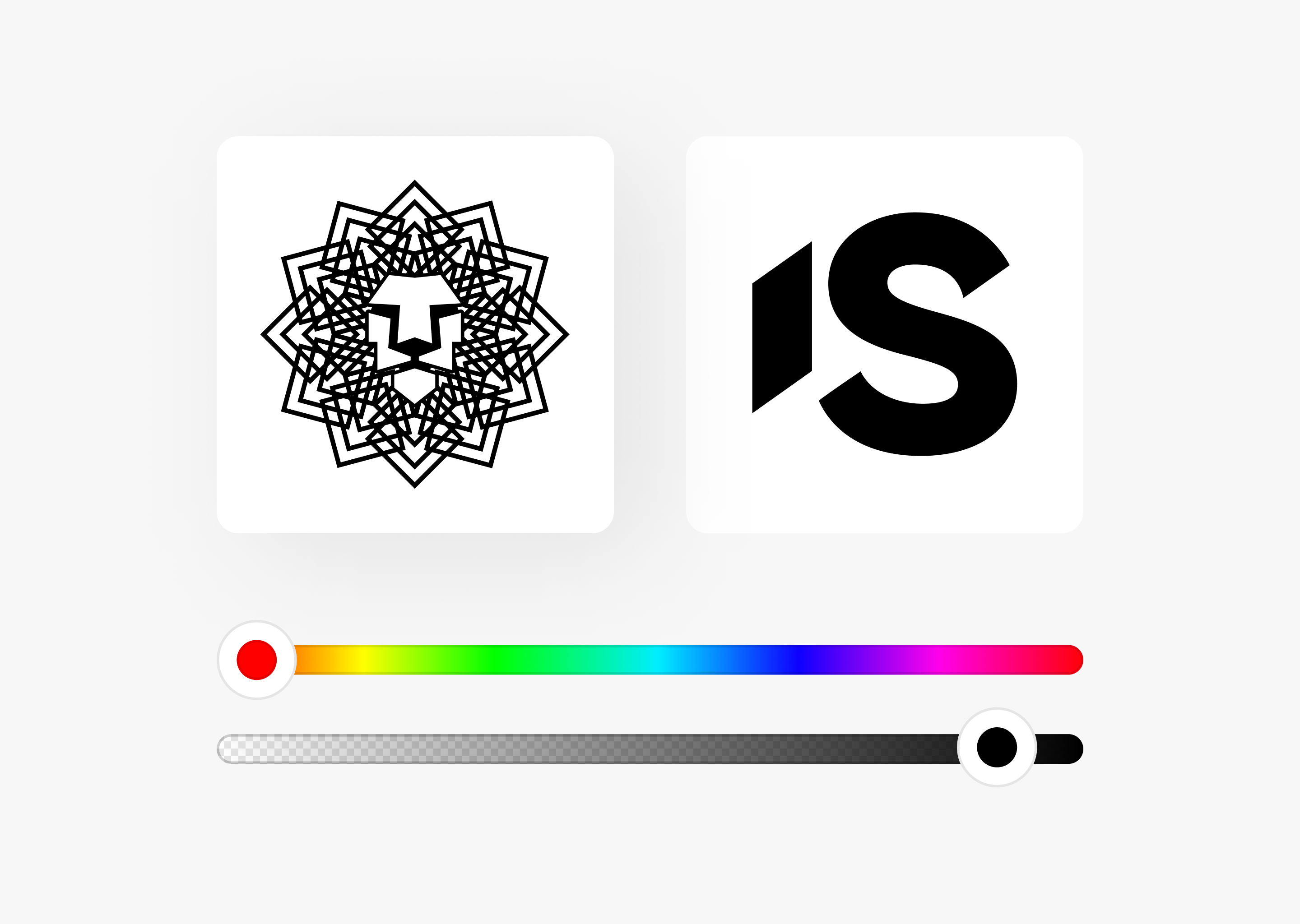
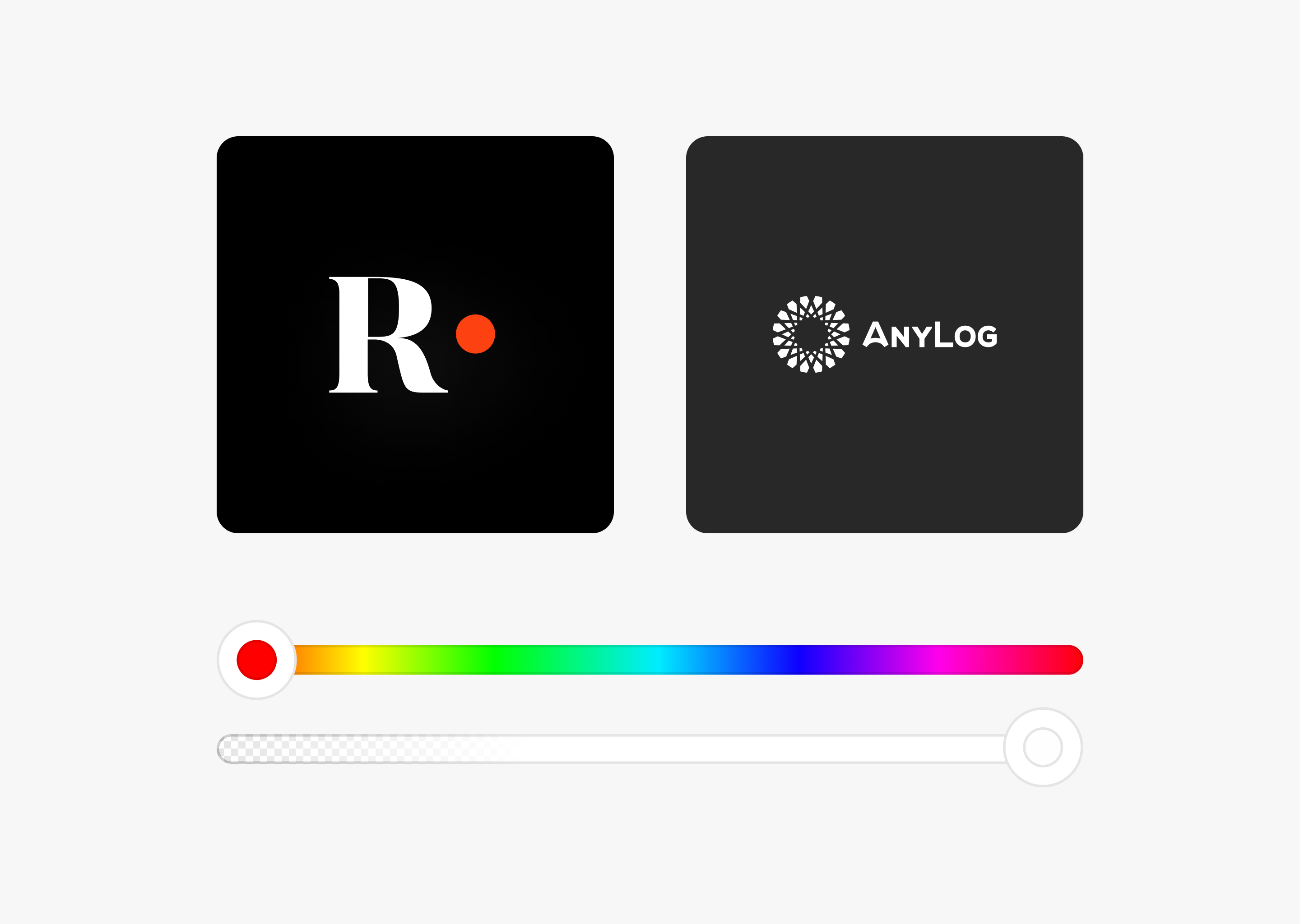
Black: Black is considered a severe and elegant color that shows power, luxury, and intelligence. Our design team often uses black for brands that want to target an audience that values sophistication and elegance.
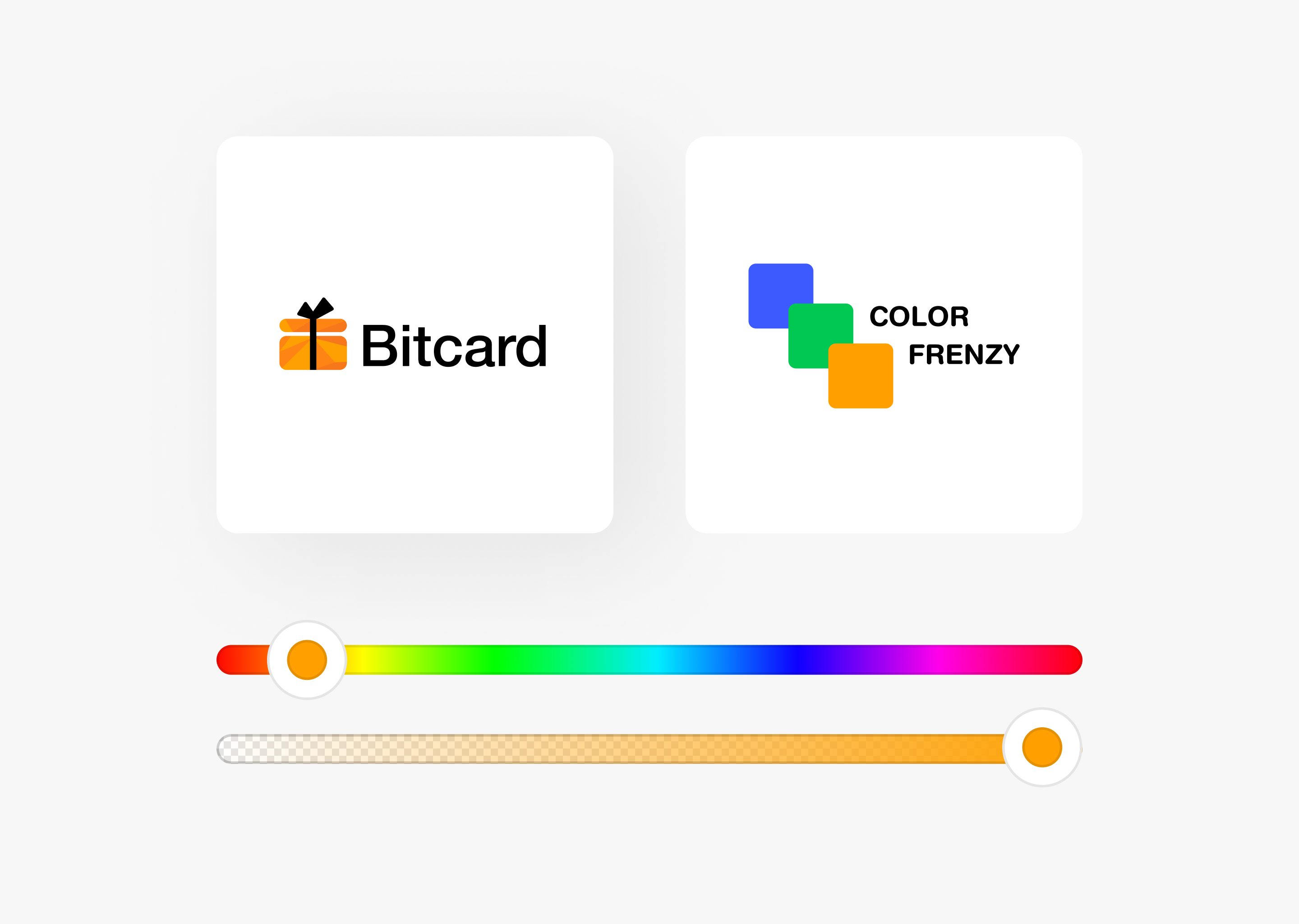
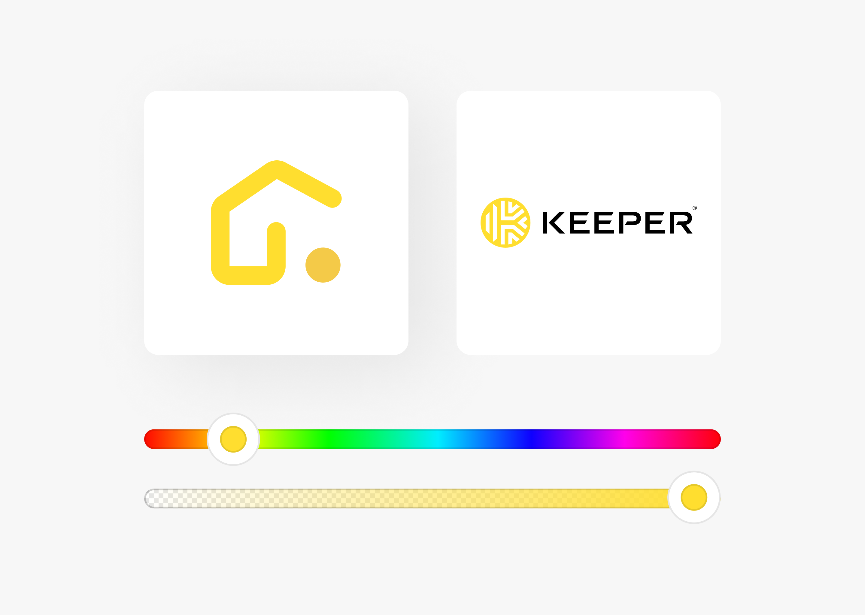
Take a look at logo examples:
White: White is clean, simple, and pure. White is popular in industries like technology and healthcare.
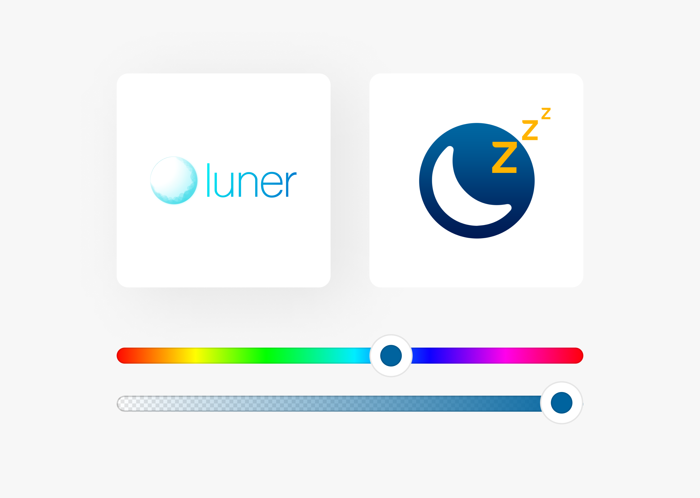
Blue: Blue logo represents trust, tranquility, and stability. We consider blue as a good logo color for technology and financial companies.
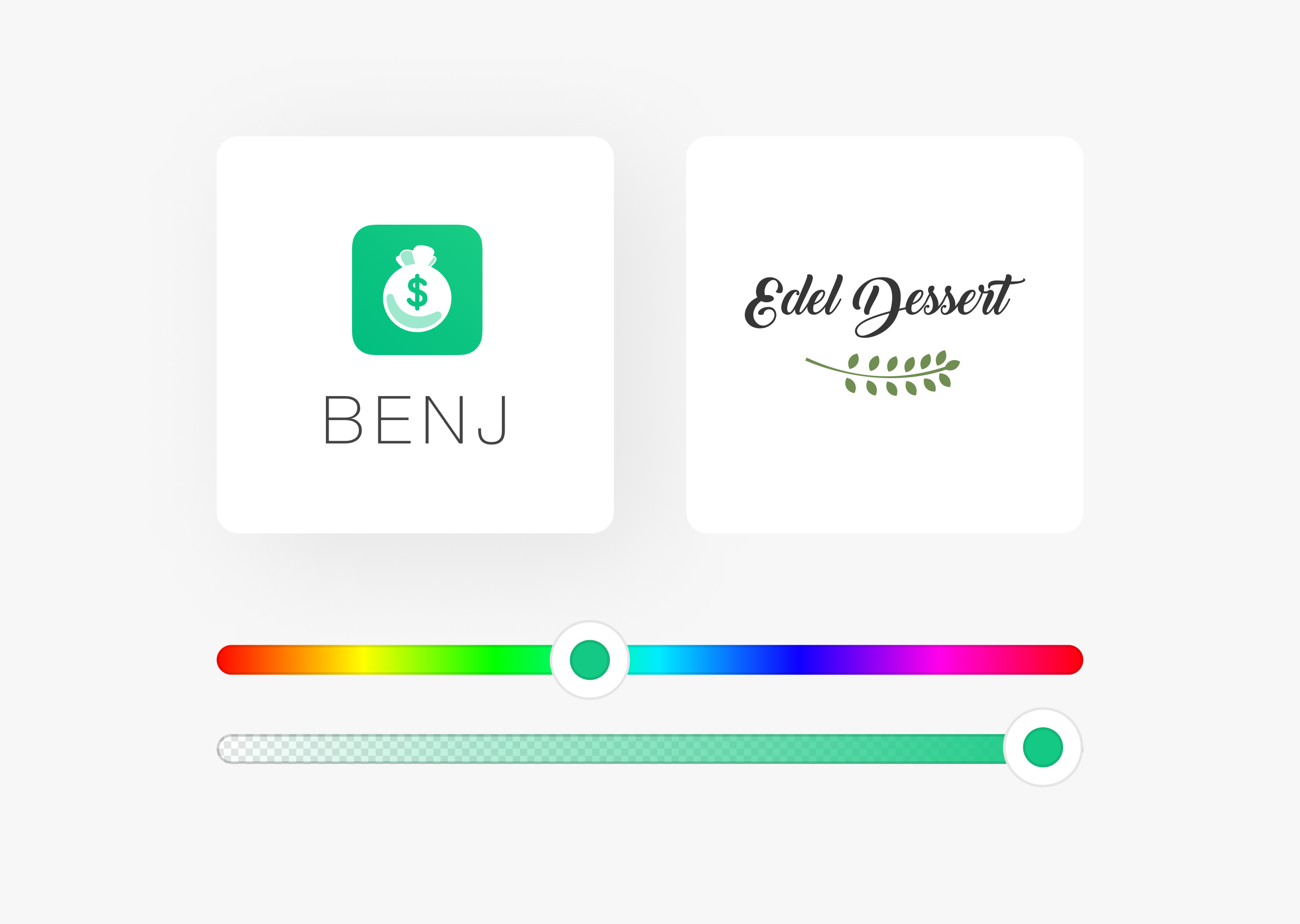
Green: Green is growth, health, and powerful nature. Usually, a green logo design implies that a company is eco-friendly and organic, but sometimes, green can refer to money, so we used green as part of the logo design of the fintech project.
Red: Red is passion, power, youthfulness, and confidence. Red is dynamic and is one of the best color choices to evoke strong emotions, attract attention, and create a feeling of urgency. In addition, companies from the food industry use this color because it increases appetite.

Orange: Orange is cheerful and creative color. Orange logos are frequently used by companies specializing in kids’ products and the food industry.
Yellow: Yellow is the color of happiness and joy. It’s fun and full of optimism. We choose this color in designs to grab consumers’ attention and encourage them to take action.
Purple: Purple logo stands for wealth, success, luxury, and courage. Also, it can present mystery and magic by playing with imagination.

So, to choose the perfect logo colors, think about the associations and emotions that colors create. We help our clients come up with ideas to make the right design during the design process. By choosing the right color, we will create the correct perception of your brand.
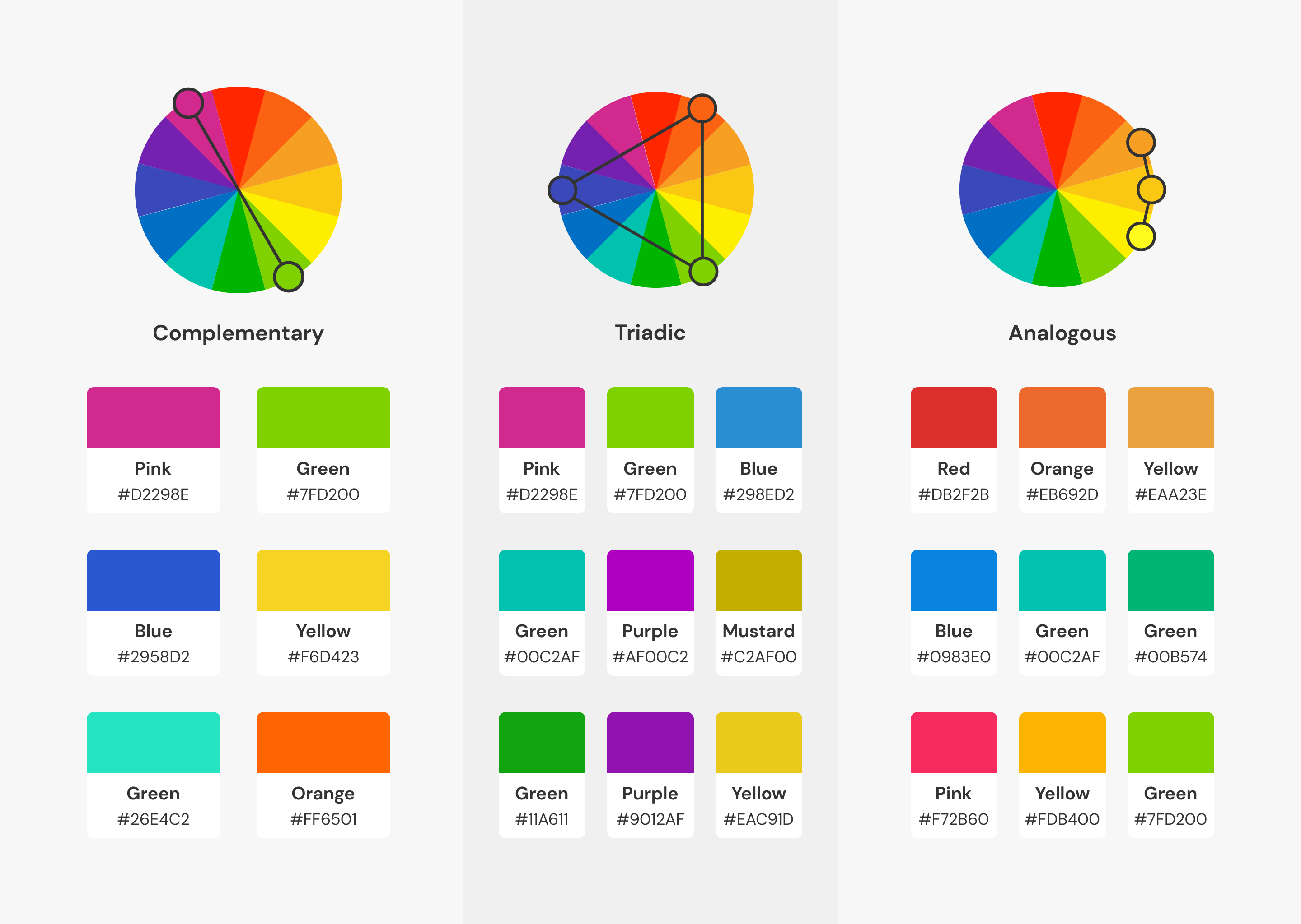
Logo Color Combinations
If you choose between a single color or color combination, remember that single-colored logos are more minimalistic and can be used on any background. Multi-colored logos are more complicated because the overall impression will depend on the color combination. Depending on the associations you want to evoke, you can combine two or more colors.
But, how to get the right color combination?
You can use ready-to-use color palettes if you are unsure how to match different colors. Here’s an example of a color scheme:
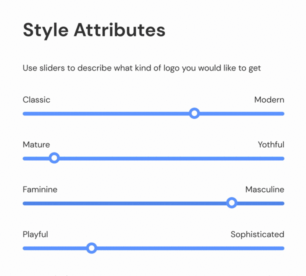
Also, during the Express Logo Design process, you can create your unique color combination and style. Use the sliders to tell us your preferences, and we’ll translate that into your future logo design.
So, one of the main characteristics of a great logo is the color it consists of. In this article, we’ve shared some valuable tips on how to choose your perfect logo colors based on your brand perception and share some ready-to-use color schemes for your inspiration.
Now, it’s time to use this knowledge and create your perfect logo design.
Want to get the perfect logo for your business or personal brand?
Don’t hesitate to get in touch with us to make it happen.